I led the onboarding and creative direction for the TikTok For Business account at Prose On Pixels (Havas), overseeing all design output across multiple campaign initiatives. I delivered tailored assets for campaigns spanning Fashion, Beauty, Automotive, Tourism, and CPG sectors. Design work ranged from digital assets—including emails and social banners—to in-depth playbooks, webinar presentations, and one-pager guides, ensuring brand alignment and strategic consistency at every touchpoint.
For this design brief with Tony’s Chocolonely, I was tasked with creating an infographic that captured the brand’s cheeky, playful, and bold tone of voice. Drawing inspiration from the distinctive, uneven chunks of the chocolate bar itself, I used these iconic shapes as visual containers to house key information within the infographic. This approach not only reflected the brand’s quirky aesthetic but also reinforced its core identity. In addition to the infographic, I designed a supporting presentation that extended the same bold, irregular visual language—creating a cohesive and characterful framework for communicating Tony’s strategic messaging.
For Terry’s Chocolate Orange Christmas campaign, I worked on a series of key visual designs that captured the playful and nostalgic spirit of the season. The visuals feature 3D cutout shapes with a soft, putty-like texture, layered to build a naive, handcrafted tableau scene. This tactile, whimsical style brought warmth and charm to the campaign, aligning perfectly with the brand’s festive tone. The designs were created for use across Digital Out Of Home (DOOH) placements and social media, ensuring a cohesive and eye-catching presence across multiple touchpoints.
For NEXT by Galderma, I worked on a global campaign developed in collaboration with healthcare professionals in the aesthetics space, aimed at promoting a body of research that sheds light on six emerging aesthetic trends. The campaign sought to empower clinicians with deeper insights into evolving patient and consumer needs.
I contributed to the design of an extensive, beautifully crafted coffee table book that brought the report to life, elevated with silver foil finishing. Each trend was given its own design route within the book, unified by a refined and contemporary aesthetic.
Moreover, I was responsible for designing six trend-specific infographics—each with its own distinct visual language to mirror the book, balancing typographic and image-led elements—to be shared across digital channels.
All the work formed part of a wider brand platform—NEXT by Galderma—developed to support the brand’s positioning as a thought leader in dermatology, and rolled out across events, press, print, and screen as part of a global campaign. Created in partnership with HAVAS Consumer Health and Galderma.
For Ella’s Kitchen, I worked on the key visuals for a campaign that embraced the brand’s playful and childlike personality. Using Ella’s signature bright colours and hand-drawn typography, I developed a range of design options featuring dynamic, energetic layouts. Each visual was crafted to reflect the brand’s charming and cheerful tone—full of movement, fun, and a sense of imagination. The result was a series of engaging, on-brand designs that captured the joyful spirit of Ella’s Kitchen and connected naturally with their family-focused audience. Here are a couple of the select ones.
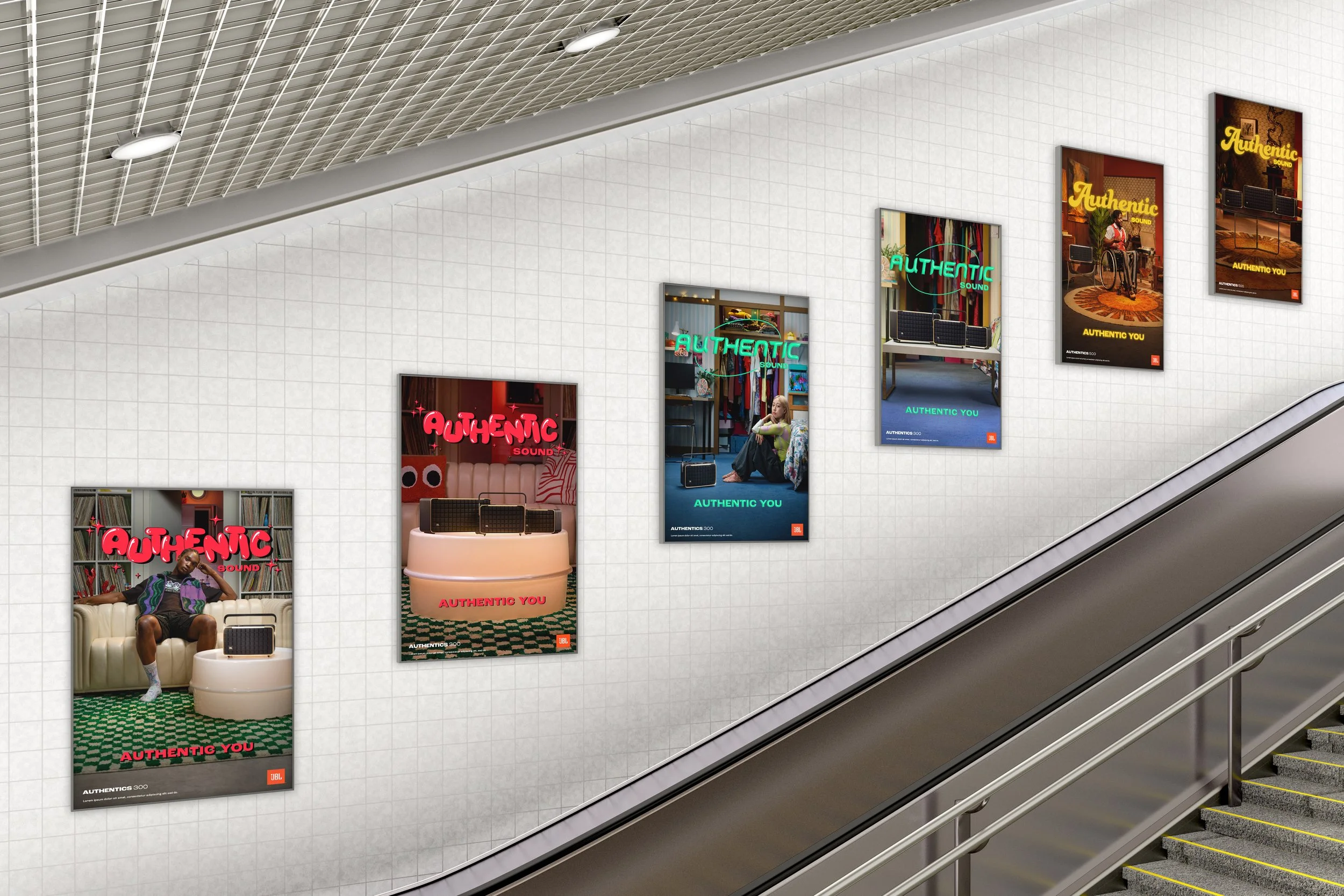
For JBL’s Authentics campaign, I played a key role in developing the design toolkit used across the entire 360 rollout, spanning print, digital, OOH, and social media. The campaign centred around four distinct musical genres, with a unique creative direction crafted for each—celebrating the diversity of sound and self-expression. Lively, characterful photography paired with bold, playful typography helped bring a sense of authentic individualism to the visuals, aligning seamlessly with JBL’s brand message. The toolkit ensured consistency across every touchpoint while allowing each genre’s personality to shine through in a vibrant and impactful way.
Whilst freelancing between September 2020 and June 2021, I led on pitch design work for a number of leading advertising firms including McCann Worldgroup, Craft EMEA and IPG. This included global pitches for major clients including Swarovski, Allianz and Philips. I worked closely with content owners and senior management to achieve top quality presentation designs that were engaging and delivered pitches and brand credentials in the most impactful and unique ways.
For each pitch, I created bespoke design systems inspired by the clients’ specific and unique needs; these designs were then used throughout all pitch stages and collateral, from creative through to all other touchpoints, including animations. By working closely with animators, I intricately storyboarded and art directed animation videos to help realise many aspects of the presentations in motion in order to bring my designs and content to life.
This was an integral shift in my design process, particularly when pitching throughout COVID-19. It enabled punchier and more dynamic content delivery for my clients, as they had to adapt to the confines of virtual environments and ‘Zoom’ pitch meetings, helping to impress their customers and ultimately win their business.
As Havas Studios began to establish itself as a leading agency, the overall look & feel of the brand needed to grow and evolve.
As part of fleshing out the brand identity, I developed a new colour palette, a visual motif/brand pattern, a PPT template, email banners/headers and templates and brand guidelines for use throughout the agency.
Here are a few select examples of designs spanning social media assets, digital banners, and merchandise for Open University. The aim was always to bring consistency and energy to their visual communications, while staying true to the institution’s accessible and inclusive ethos. Each piece is always designed to feel modern, engaging, and adaptable utilising their bright gradient colour scheme as well as geometric shape design system, which helps to reinforce The Open University’s identity and connect with their diverse audience across multiple touchpoints.
For the Department for Education’s Early Years campaign, I worked on the visual design for the nationwide Do Something Big initiative, aimed at encouraging people to consider a career working with small children. In anticipation of the expansion of the early entitlement offers, the campaign needed to feel both aspirational and approachable.
I helped design assets that utilise a distinctive visual system built around modular shapes or ‘building blocks’—playful graphic elements that appeared to delicately balance, symbolising both the joy and responsibility of early years education. These blocks also served as containers for campaign photography, adding structure and warmth to the layouts. The campaign ran across TV, cinema, online, radio, and major transport hubs, including bus and tube stations—delivering a cohesive and compelling message: Do something big. Work with small children.
For Madri’s Shoreditch Boxpark takeover, I worked on a full-scale experiential design project that transformed the venue into an immersive brand environment. I helped design a series of vinyl wraps that covered nearly every wall, bar, and corridor—creating a bold, high-impact visual experience. The creative direction leaned into a ripped, collage-style aesthetic, using distressed textures and layered graphics to evoke a grungy, energetic atmosphere. With a striking palette of red, black, and white, the space captured a raw, rock’n’roll spirit that aligned perfectly with both the Madri brand and the urban edge of Boxpark.
For Air Wick (part of Reckitt), I designed a series of key visuals and layouts for a campaign promoting three of their core products: Active Fresh, Essential Mist, and Plug-Ins. The creative direction combined delicate wildflower imagery with soft smoke and mist effects to evoke a sense of freshness drifting in from the garden or wilderness—transforming indoor spaces with natural, airy energy. I explored a range of layout compositions and floral typography treatments to bring this concept to life, ultimately arriving at three distinct yet cohesive key visuals that captured the ephemeral, nature-inspired essence of each product.
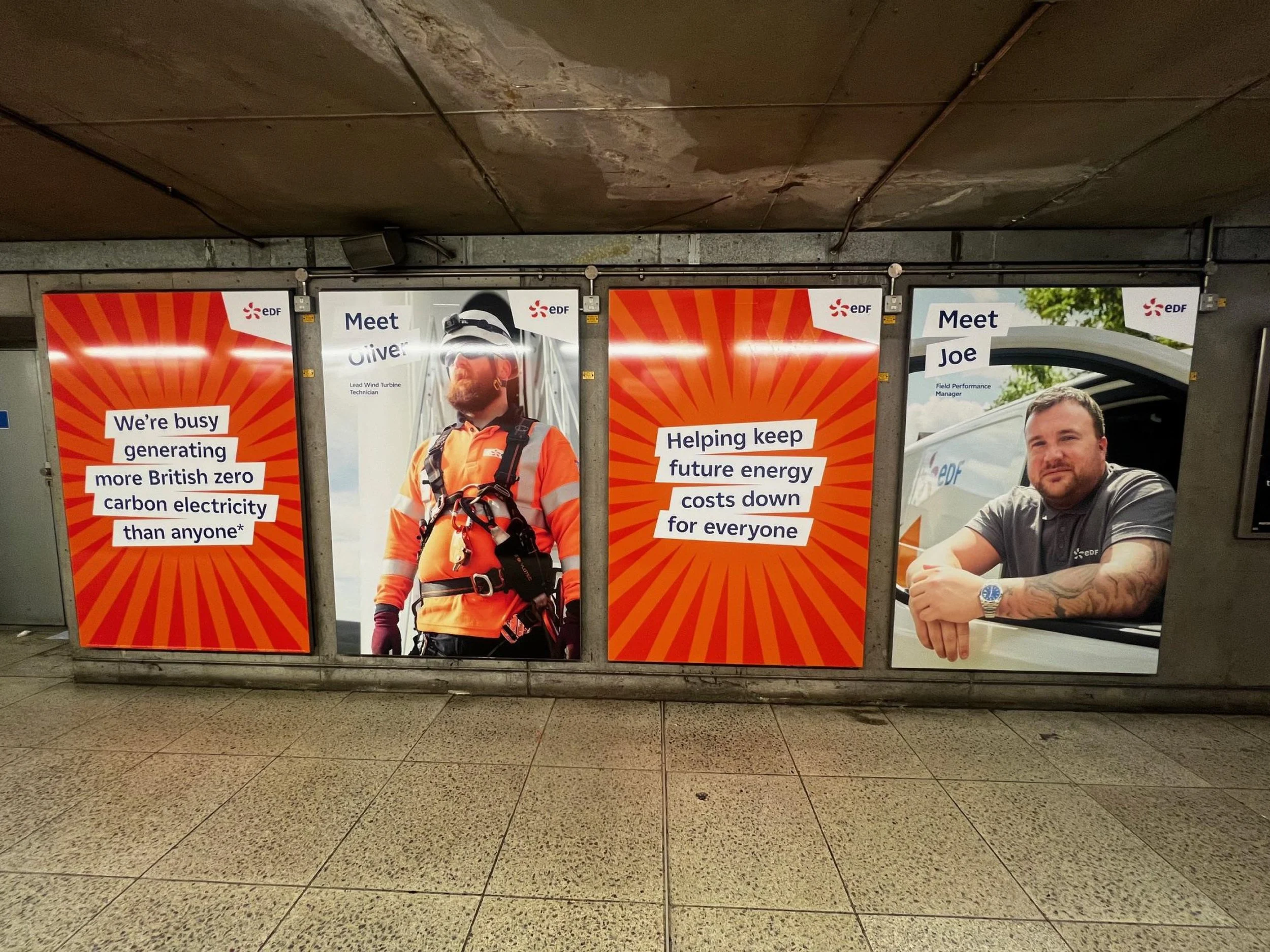
For EDF’s Busy Doing Nothing 360 campaign, I was responsible for designing a wide range of assets across both print and digital platforms. This included Out Of Home (OOH) and Digital Out Of Home (DOOH) placements, press ads, social media content, and online digital banners—all designed to bring the campaign’s lighthearted yet impactful message to life. A standout element of the campaign was the station domination, where I designed for a full takeover of select underground stations. This included creative for digital 6-sheets, escalator panels, and ticket barriers, resulting in a bold and immersive brand experience that captured commuters’ attention and reinforced EDF’s playful but purposeful tone.
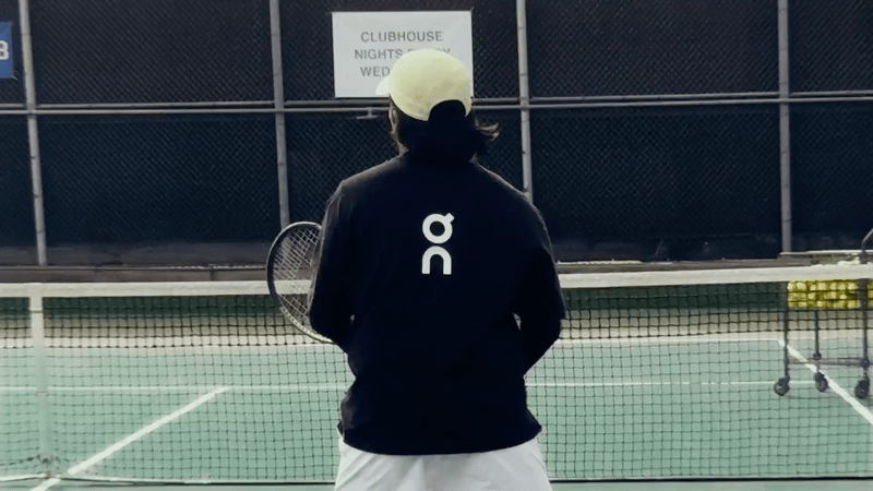
Working with ON, I contributed to a series of digital campaigns and developed a presentation template that reflected the brand’s clean, minimal, and performance-driven aesthetic. My designs embraced ON’s distinctive monochrome palette, combining strong, dynamic photography with bold, type-led layouts to create visually impactful executions. Whether for social, web, or internal communications, the work maintained a consistent tone that echoed the brand’s sleek, sporty identity—delivering clarity, confidence, and cohesion across every touchpoint.
As part of a global initiative to encourage regular check-ups for heart conditions, I designed key visuals for the Global Heart Hub campaign.
My designs were used in nine different countries – UK, USA, Germany, India, Italy, Japan, Mexico, Portugal and Spain – both for use on a variety of social media channels as well as physical posters to be used in pharmacies.
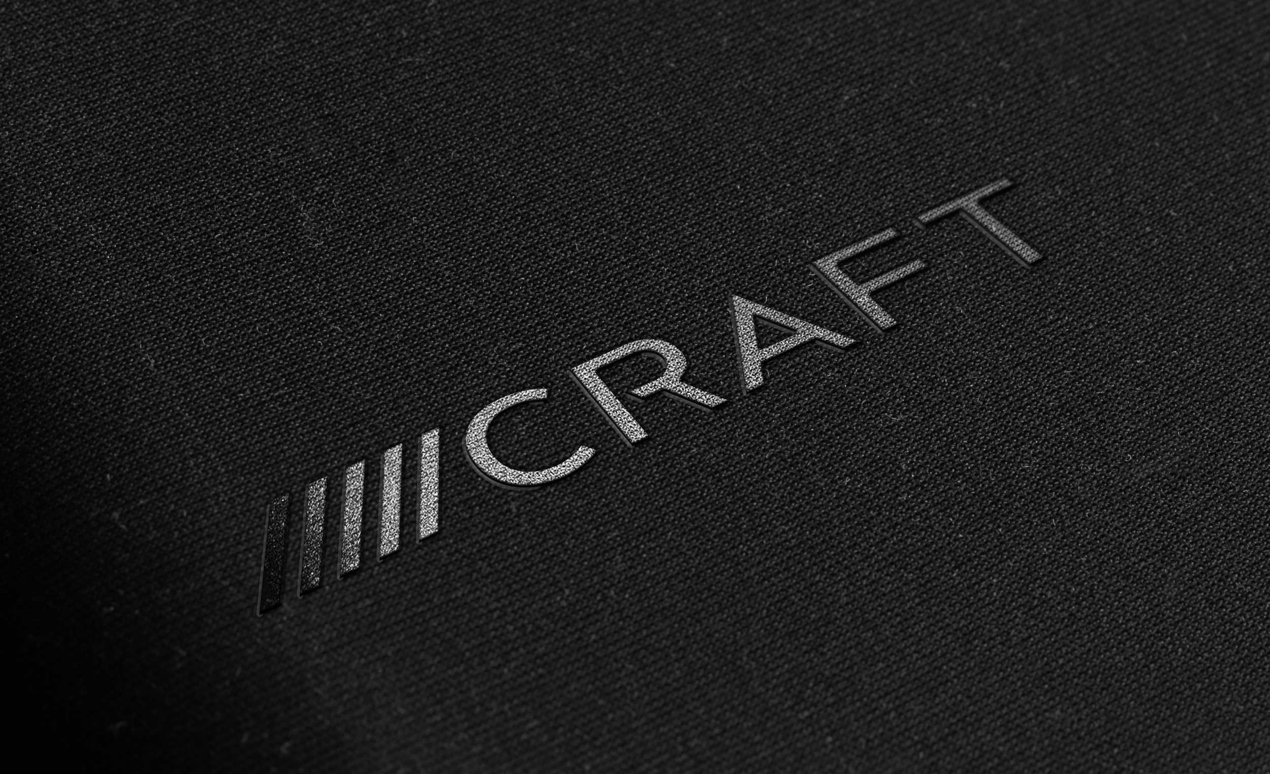
Whilst at Craft, I was the lead designer and creative as part of the team producing a full brand revamp. I worked with the New York office (HQ), Global Marketing Director and McCann Design Director to create a series of brand assets that would better communicate Craft’s ethos and meticulous approach to advertising and design.
As a leading production studio, we took a minimalist approach to the branding to let Craft’s work and content take centre stage. We decided on a monochrome primary palette of black and white completed by a more colourful secondary colour palette.
The five diagonal lines used for the brand mark were inspired by the lines used on a production slate, evoking the craftsmanship at the company’s core as well evoking feelings of being ahead of the curve, faster and more forward-thinking. Importantly also, they signified Craft’s 5 main brand values: Creativity, Efficiency, Transparency, Continuity and Accountability.
This rebrand involved all aspects of physical and digital communications, from the Craft logo and brand mark to website design and email signatures - even including ISO certified stamps and merchandise.
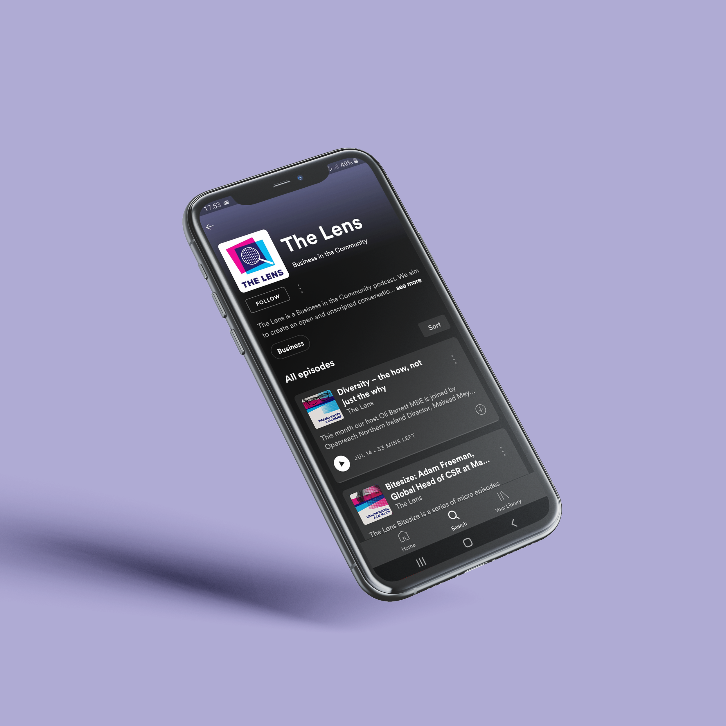
The Lens – UK Responsible Business Podcast is a Business in the Community podcast that aims to create an open and unscripted conversation between current and future business leaders, as well challenge the way responsible business is thought about.
I was tasked to create a new identity and look & feel for the brand. I designed a new logo, new episode cover artworks and a visual language and template design for social media posts.
The logo went through hundreds of variations and iterations, but the final approved one is a simple riff on the Business in the Community logo which utilises the same brand colours and overlapping colour effect. The introduction of the halftone effect within the magnifying glass is a nod toward the idea of being able to see the finer details in something on closer inspection, to mirror the way the podcast’s participants deep-dive into any given topic.
The artwork I created for each podcast episode is a continuation of the visual language of the logo, using a halftone pattern combined with an abstract collage of that particular episode’s guest and brand colours. The collage idea mirrors the way the episode’s conversations organically evolve, in an unscripted way.
For the social media post designs/templates, again I carried through the visual language used in the logo and episode artworks and developed a coding system using different colours depending on the content of the episode being promoted: Green for environmental issues, Yellow for Diversity, Blue for Education and Pink for Mental Health & Wellbeing.
As Studio Designer at Craft, I led on presentation design for a wide range of international companies, both existing and potential customers.
My creative and engaging pitches were instrumental in winning new customers, as well as successfully engaging with existing clients and retaining their business.
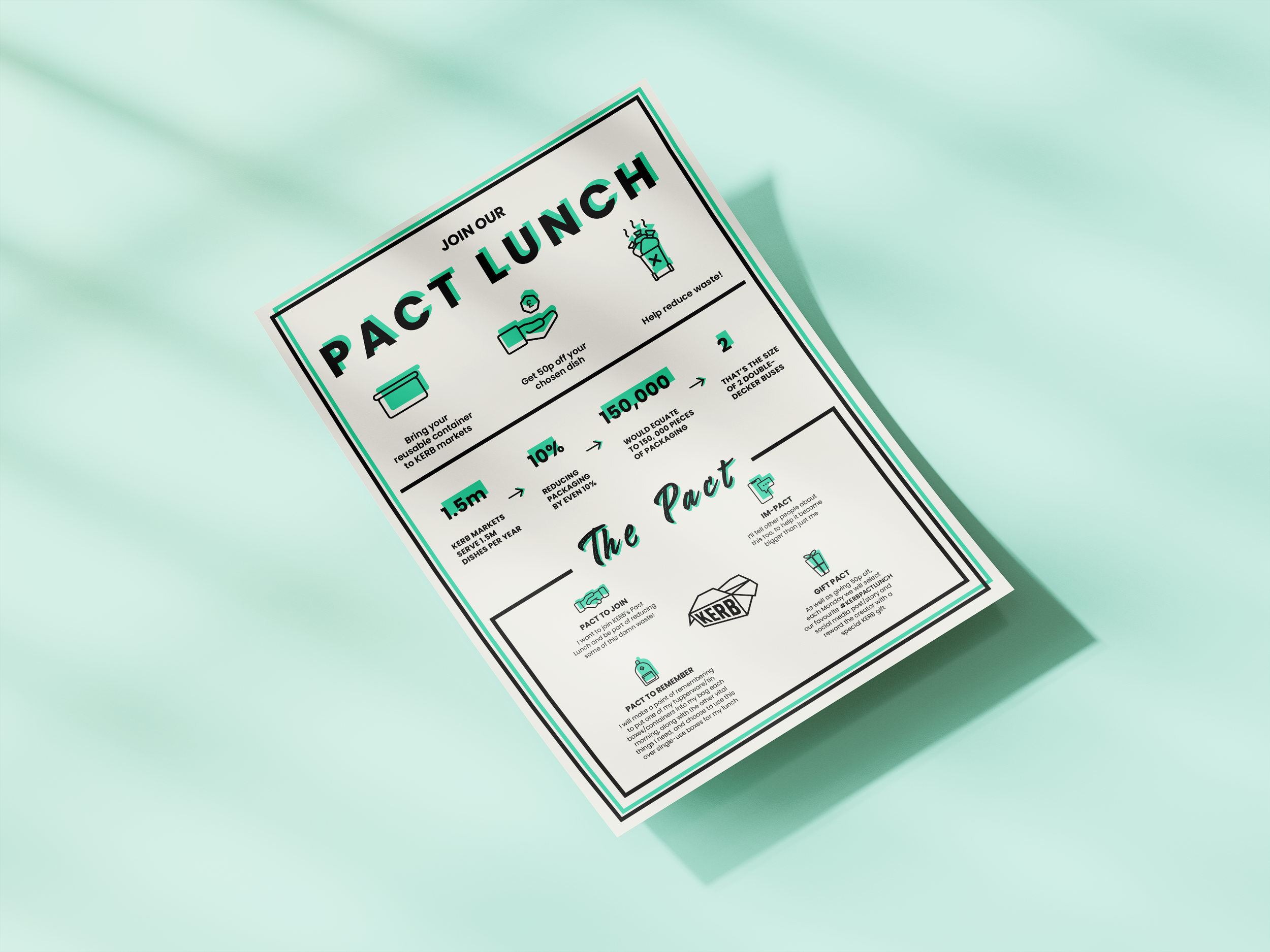
https://www.kerbfood.com/pactlunch/
KERB are London’s leading street food brand, well known for their iconic lunchtime markets throughout the city and community of delicious traders.
With their Pact Lunch campaign, they wanted to take radical action against food wastage and its environmental impact. The campaign’s purpose was to encourage visitor’s to their markets to bring their own food containers, which would earn them a small discount on the price of their lunch.
In keeping with the idea of having a ‘greener footprint’ I used an offset effect with the design, including the typography and icons. This visual treatment was to subtly mirror the idea that we, as a society, should be trying to bridge the gap between what we currently do and how we can easily change our behaviours to help save our planet.
For this campaign with Randstad, I was worked on the creative development of visual designs to communicate the important distinction between equity and equality. The goal was to make the messaging as accessible and inclusive as possible, using a simple, straightforward visual and written approach. By stripping back complexity and focusing on clarity, the campaign aimed to engage a wide audience and encourage a better understanding of these concepts in the context of workplace diversity and inclusion. The result was a clean, approachable design language that supported Randstad’s commitment to meaningful, people-first communication.
As part of a rebrand of the H-Advisers group, Cicero needed a complete website revamp.
As part of the design process, I devised a new site structure by leading an information architecture project with Cicero’s key stakeholders and created a desktop prototype in Adobe XD.
At Havas Studios, I regularly help create key visuals for brand campaigns as well as mockups to show the work in-situ.
Here are a few select examples of key visuals, OOH and POS I’ve worked on for brands such as Gaviscon, John West, Madri, Reeses and Hermes.
Every year McCann Worldgroup publishes ‘Well Told 2 Meaning’, an internal guide for best practices, strategies and approaches toward successfully managing leading brands and shaping creative work of the highest calibre. For 2020, I was asked by the Chief Production Officer of McCann Worldgroup to design the guide’s cover artwork, as well as pullout hero quote pages.
For the cover artwork, my concept used a singular colour palette (blues & greys), with occasional additions of an accent colour (yellow). I used circles as loose inspiration to convey the cyclical relationship between truth & meaning.
For the pullout quote pages, a simple typographic treatment with high contrast was used in addition to handwritten elements, doodles, scribbles and notes to convey a sense of ‘craft’ and ‘process’. This gave life to the guide and to all the things Craft is and champions as part of its working methods, such as questioning, progressivism and adaptation.
At Havas Studios, I regularly lead design for pitches and submissions with the Global New Business and Marketing team.
Here are three submissions I designed for ‘2022 Agency of the Year’, ‘Creative Head of the Year’ and ‘New Business Team of the Year’. These submissions were designed to be as creative and interesting as possible, despite the restrictions of a word and page count.
In collaboration with (R/GA), I led the Craft Design team in cohesively bringing together a Sales Toolkit and Catalogue for Samsung’s Built-In and ‘Infinite Line’ Kitchen range.
Following strict brand guidelines, I devised a system of hierarchy that would aid customers and sales personnel on the shop floor to to easily and quickly navigate through the documents to the relevant sections and/or product ranges in need.
I kept the design minimal and sleek, using a neutral colour palette of blacks and greys to allow the Infinite Line graphical motifs (resembling eclipses and lunar arcs) to feel high-end. This style also allowed photography and the Samsung products to take centre stage, which I also emboldened by making creative decisions around the print specs and finishes.
During my time at Craft (McCann), I designed, storyboarded and art directed several explanatory videos to help demystify Craft’s asset journey for customers, from client brief right through to production and delivery.
The below storyboard example was for a leading car brand pitch. inspired by automotive aesthetics, the visuals were kept clear, linear with a slight ‘technical’ looking to fit the relevant brand.
As Studio Designer at Havas Studios, I led the design for all presentation decks, whether for pitching to new clients or for designing branded content and/or templates for existing clients.
Clients included Huawei, Pimco, Sainsburys, Randstad, Qatar State Tourism Board, Harman, Back Market, Uber Eats and the Department of Education.
Albert needed a wider range of marketing assets to use in ads, visual campaigns, emails, social media and any other marketing channels. I took the opportunity to introduce a new brand identity and visual language for the brand, modernising its look and feel as well as developing a new app icon.
I also created app store preview videos to demonstrate app features for new updates and releases.
I wanted to inject the Albert brand with a tongue in cheek sense of humour, to reflect the demographic of freelancers and sole traders. Owing to the fact that this is a diverse audience spanning many different professions, we decided that our underlying message should speak to the fact that they are people who value their independence and freedom.
We established an underlying message throughout that emphasised Albert making finances simpler and more approachable. Here are a few select examples of different campaigns I designed and led during my time at Albert.Albert app when on to be acquired by Santander and later became Asto app.
For this project, I was commissioned to design the cover artwork for a poetry chapbook by the poet and university professor, Marnie Ritchie. Her poetry has a visceral, carnal, even fleshy quality to it – with many references to body parts and bodily functions. The concept for the book cover was born from its title as well as the up-close fixation on the human body, almost to the point of sexual abstraction.
I wanted to evoke a sense or idea that there was an orgasm trapped or contained within an egg before it breaks free. It was also inspired by envisioning how it might look if a human was to be packed into a womb-like pod, such as an egg – contorted, angled, twisted and intertwined. This lent itself to an almost Dadaist-inspired approach to collage.
I collected physical cutouts from old magazines/publications, scanned and digitised them before arranging them into one ‘monstrous’ arrangement. My hope was that this would give the cutouts a more physical quality. This serving as the backdrop to a single, cracked egg was meant to be a powerful visual contrast between the inside incubation and the outside flexibility, freedom and/or abandonment of any kind of containing capsule, such as an egg. After all, a ‘hatch’ can also mean a door to an aircraft/spaceship/submarine – a portal to another dimension, if you will.
https://dulcetshop.myshopify.com/products/hatch-marnie-ritchie
At Havas Studios, I have created brand guidelines for a number of high-profile clients.
Pictured here are a select few I have worked on including Vanish, Air Wick (Reckitt Beckinser) and Philip Morris.
Ideation Coaching combines creativity, psychology and coaching to support and empower ambitious professionals.
After understanding how the co-founders set their coaching business apart from competitors, I created a brand identity that would showcase their unique approach and method. As well as creating a responsive logo design, I created bespoke illustrations and designed their responsive desktop/mobile website.
Overall, it was important to evoke a sense of creativity and playfulness throughout the brand, in order to conjure a sense of what it does and stands for – an innovative approach to coaching through creativity.
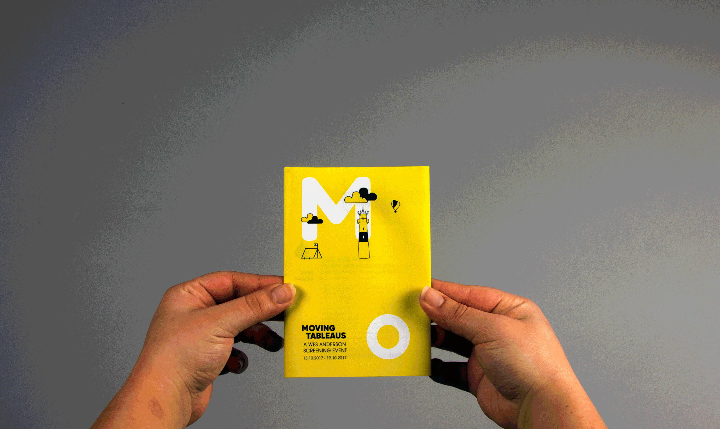
This is Part I in a collection and selection of briefs I have worked on to explore a variety of different styles, formats and media through different brands and types of briefs.
It shows different experimental approaches to briefs as well as varying techniques and processes.
This is Part II in a collection and selection of briefs I have worked on to explore a variety of different styles, formats and media through different brands and types of briefs.
It shows different experimental approaches to briefs as well as varying techniques and processes.
At Havas Studios, we are responsible for designing and creating desktop and mobile email campaigns for the VW group, including brands such as Audi, Porsche, Seat, Cupra, Skoda and VW.
In 2022 we switched our workflow from Photoshop to Figma for these builds. Here are examples of two SEAT email templates I built in Figma.
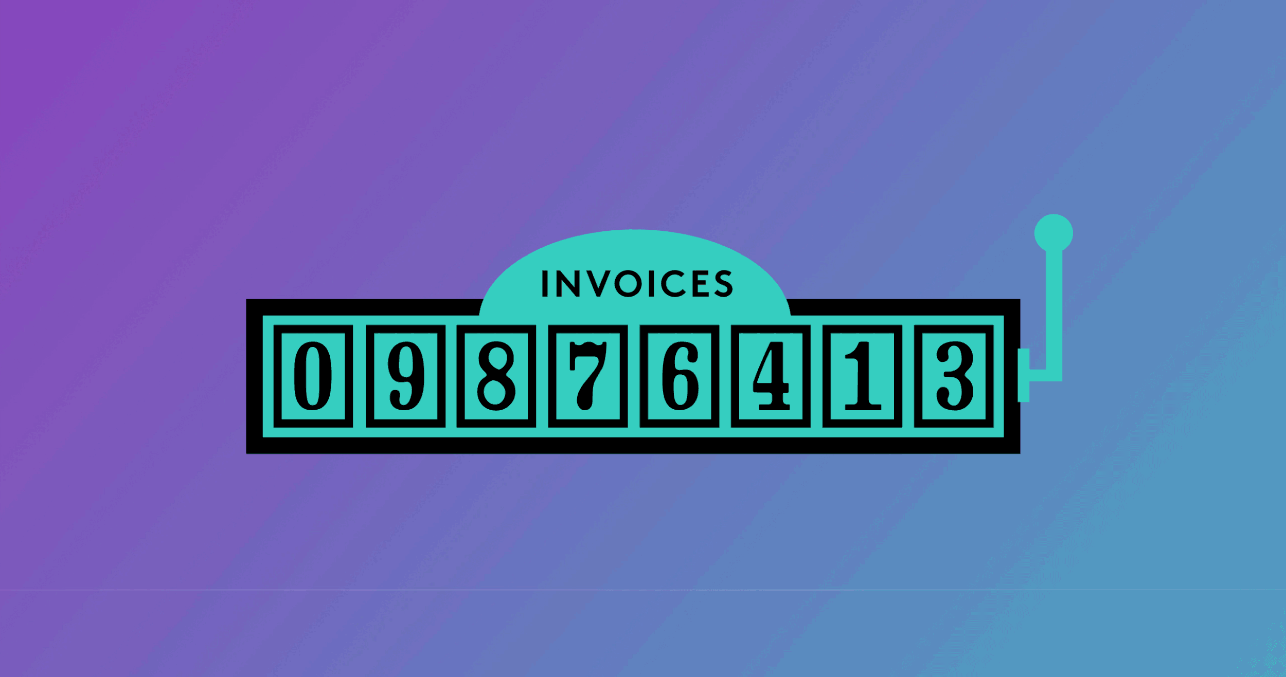
Infographics are a consistent design request in the advertising & production worlds I’ve worked in, for the purpose of sharing information or processes – whether as part of pitches or as part of branded client work.
Here is a small selection of branded infographics, including lobby signage, user-flows created for large-scale vinyl prints and visualisations of metrics for branded client decks.
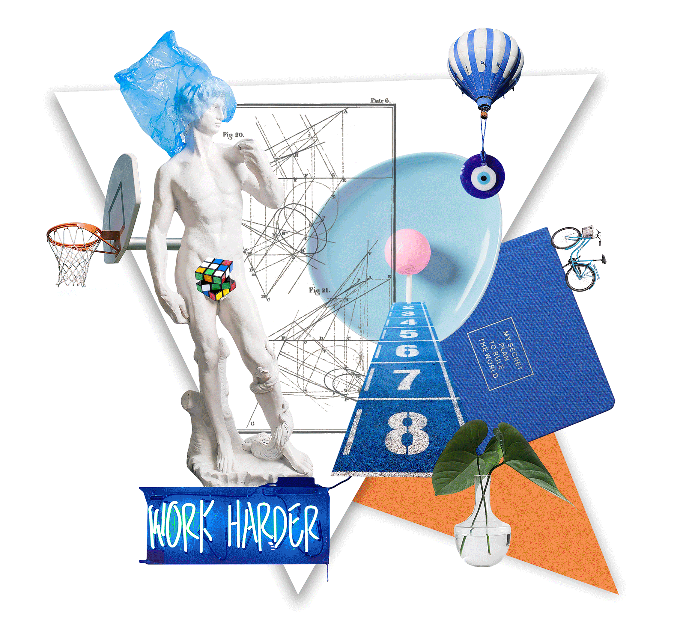
A personal project of an ongoing series of digital collages using found imagery, scanned photos or stock photography.
This was a poster and series of icons I created as part of an early COVID-19 campaign run by Kleenex aimed at encouraging people to follow the rules and keep people safe.
The icons and illustrations were bespoke and created in a ‘hand-drawn’ illustrative style to introduce the friendliness and approachability associated with the brand, as well as to simplify an important process during a time of fear and unknowns. The campaign was also translated into several languages.
I sometimes accept creative commissions to illustrate visuals/infographs for articles; or to create the artwork for peoples’ side hustles/pet-projects, such as album or book covers. Here are a few select examples.
This brief was completed whilst freelancing for McCann Milton Keynes. I designed a brochure and digital catalogue for KOMPAN, the outdoor fitness brand. Their mission statement is to fight fake fitness and make outdoor fitness more accessible, as well as take it to the next level.
I followed their brand look & feel, utilising their bright colour palette and bubbly fonts. I also created some icons and infographics to showcase some of their statistics and to make the information more digestible.
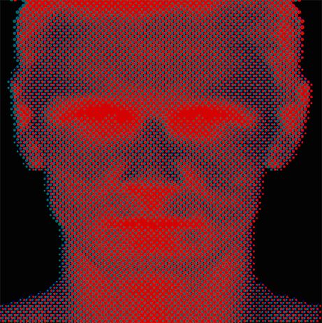
For this brief, I worked with a music producer to realise an artwork and concept for their debut album.
The idea and effects were inspired by a simple manipulation of colour channels of a black and white striped image that had been warped and rippled, introducing a psychedelic vibe that matches the genre and overall vibe of the album.
Whether it’s therapists or food businesses, ceramics studios or freelancers, I love creating logos and brand assets for small businesses and professionals to help them feel more confident about sharing their products or service with the world.
Here is a selection of some of my work.
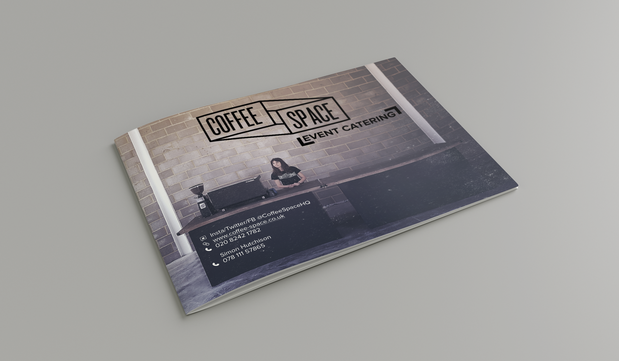
Coffeespace are a coffee event catering business and part of KERB, London’s premier street food and events business. I was commissioned to create a brochure and digital catalogue for Coffespace to showcase its offering and give a refined, high-end look & feel to customers and clients.